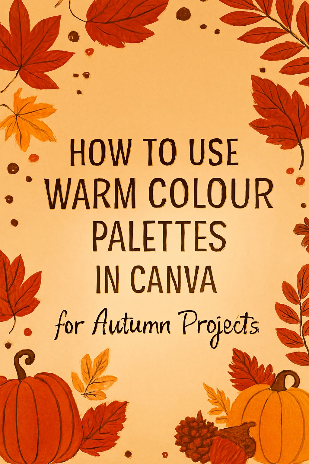
Blog Post: How to Use Warm Colour Palettes in Canva for Autumn Projects
There’s a certain magic in the air when autumn arrives. The world transforms into a breathtaking canvas of fiery reds, burnt oranges, golden yellows, and deep, earthy browns. It’s a season that doesn’t just change the landscape; it changes how we feel. It evokes a sense of cosiness, nostalgia, warmth, and grounding.
As a creator, capturing this feeling in your designs—whether for your small business, your social media, or personal projects—can create a powerful, instant connection with your audience. And the perfect tool to bring this autumnal warmth to life is Canva.
This guide will walk you through not just how to choose warm colours, but how to weave them into your designs to tell a story and stir the soul. Let’s turn that autumn inspiration into stunning visual reality, one warm hue at a time.
Part 1: The Emotional Language of Autumn Colours
Before we even open Canva, let’s understand the ‘why’ behind the colours. Each shade in the autumn palette whispers a different emotion.
-
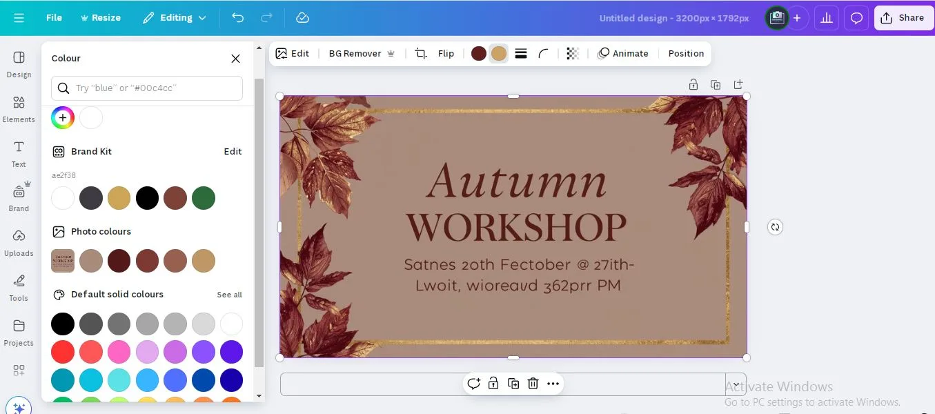
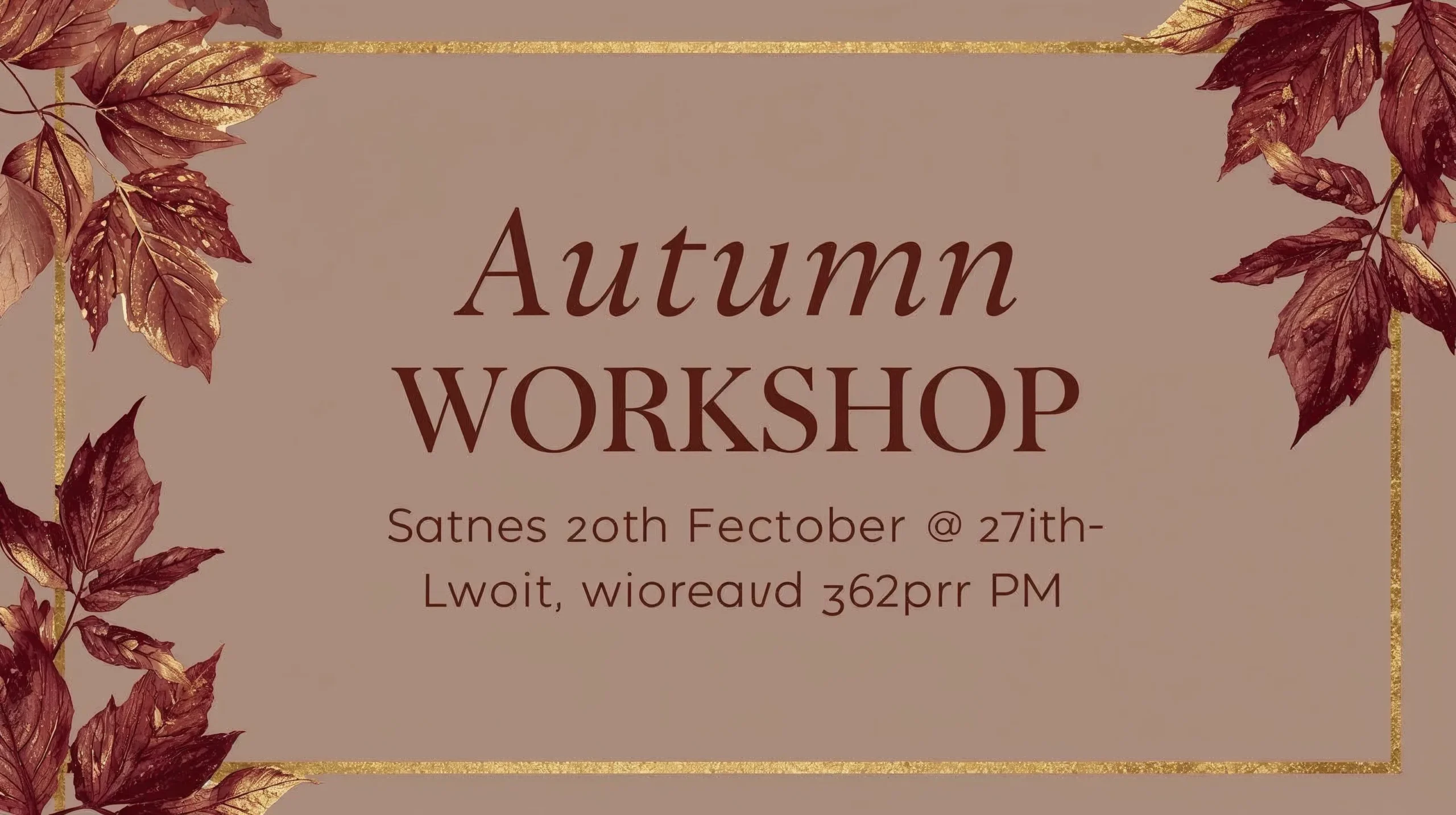
Deep Reds & Burgundies: These colours speak of passion, richness, and comfort. They’re the colour of a fine wine, a plush blanket, and the last resilient berries on a bush. They feel luxurious and grounding.
-
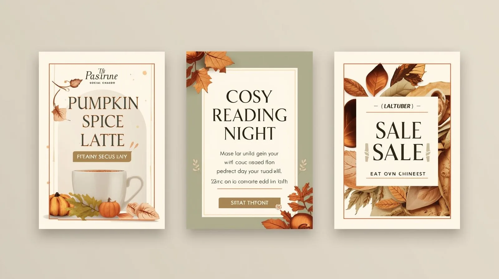
Burnt Orange & Terracotta: The heart of cosiness. This is the colour of crackling fireplaces, pumpkin spice, and turning leaves. It’s inviting, friendly, and bursting with creative energy.
-
Mustard & Golden Yellow: This is the last kiss of sunlight on a crisp afternoon. It evokes feelings of joy, optimism, and warmth. It’s a brilliant accent colour to bring light and happiness to your designs.
-
Olive & Sage Green: These muted, earthy greens provide balance. They represent the enduring evergreen and the muted moss on ancient trees. They bring a sense of calm, freshness, and stability to a palette.
-
Chocolate Brown & Taupe: The ultimate earth tones. These are your anchors, representing the soil, bare branches, and roasted coffee. They make designs feel solid, reliable, and incredibly cosy.
Part 2: Finding & Creating Your Warm Palette in Canva
Now, let’s translate this feeling into a functional Canva palette.
1. Start with Canva’s Built-in Treasures:
Head to your Canva project and click on the colour icon in the toolbar. Scroll through the “Suggested” palettes, especially around September to November—Canva often releases seasonally-themed collections. Look for palettes named “Autumn,” “Harvest,” or “Vintage.”
2. Be a Creator: Use the Custom Colour Tool:
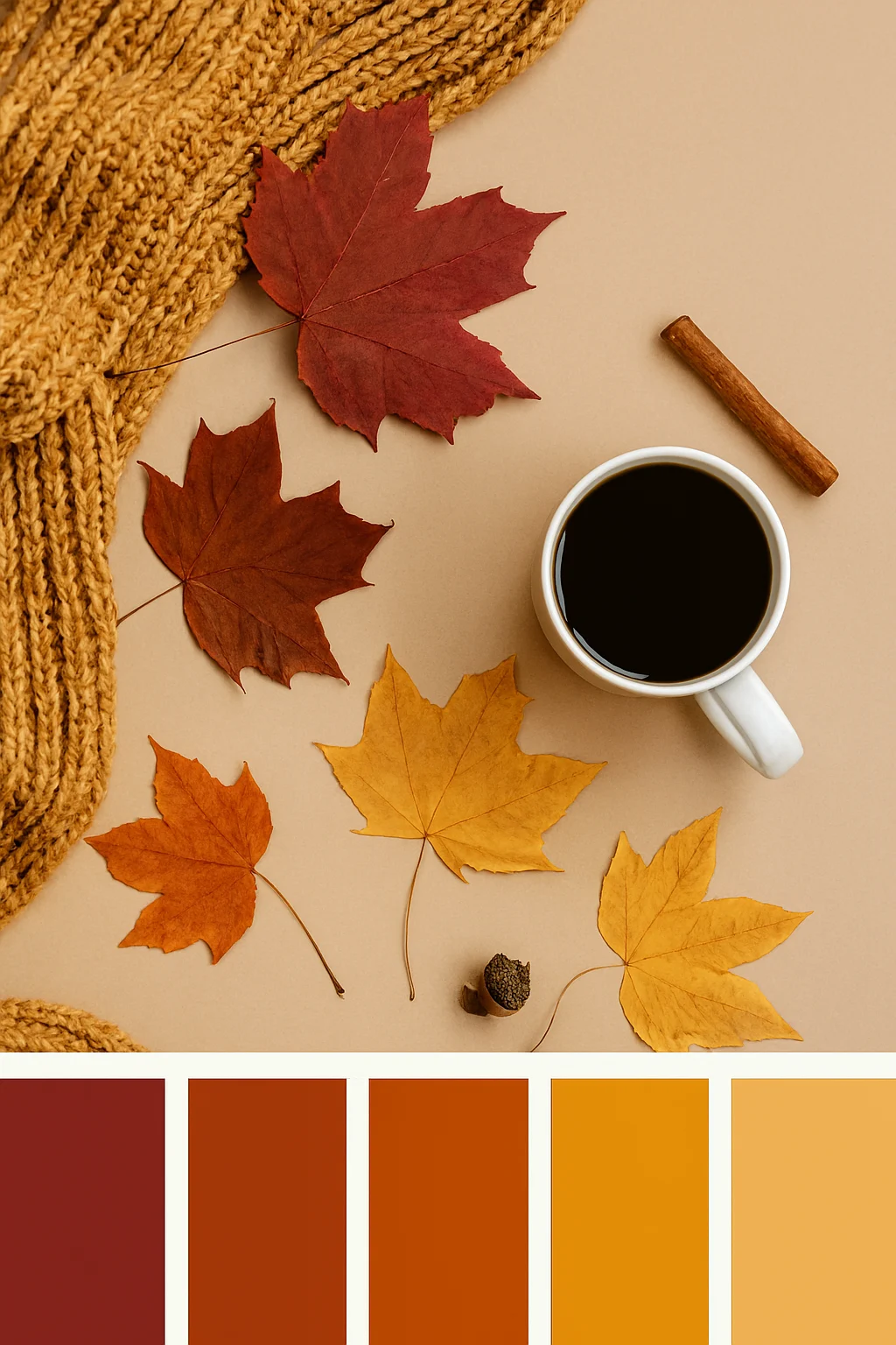
For a truly unique touch, create your own. Click “New colour” and use the colour picker (the dropper icon). This is where the magic happens! You can upload a stunning autumn photo you took—a forest path, your favourite autumn sweater, a close-up of a leaf—and extract colours directly from it. This guarantees a harmonious and personal palette.
3. The Rule of Thumb for a Balanced Palette:
A great autumn palette has a mix of:
-
A Dominant Colour: Your background/base (e.g., Cream or Taupe).
-
A Primary Colour: Your main attention-grabber (e.g., Burnt Orange).
-
An Accent Colour: A pop of contrast (e.g., Mustard Yellow).
-
A Neutral: To balance and provide space for text (e.g., Chocolate Brown).
Part 3: Weaving Your Palette into Stunning Autumn Designs
Knowing the colours is one thing; applying them effectively is another. Here’s how to make your autumn projects sing.
For Social Media Graphics:
-
Backgrounds: Use a deep burgundy or olive green as a solid background to make your text and product photos pop.
-
Text & Elements: Use your accent colour (like mustard yellow) for your most important call-to-action or to highlight a key price.
-
Pro Tip from www.sunygraphics.co.uk: When designing social media posts, remember that warm colours are inherently eye-catching. To avoid visual overload, ensure your text has high contrast against the background. A cream-coloured text on a chocolate brown background is both readable and deeply autumnal.
For Invitations & Marketing Materials:
-
Elegance through Typography: Pair these rich colours with elegant, serif fonts. A deep red invitation with gold foil-effect text feels luxurious and seasonal.
-
Use Textures: Canva’s elements library has wonderful paper textures, leaf illustrations, and watercolour stains. A subtle paper texture behind your text can make a digital design feel tactile and cosy, as if it were printed on beautiful, thick cardstock. Speaking of which, when you’re ready to bring these designs into the physical world, the team at www.sunygraphics.co.uk specialises in translating digital beauty into stunning, tangible print.
For Presentations & Documents:
-
Create a Template: Set your custom autumn palette as the default for a presentation. Use a neutral colour for most slides and your primary colour for title slides to create a professional, seasonal flow.
-
Data Visualisation: Use your accent colours for charts and graphs. A bar chart in varying shades of orange and yellow is far more engaging and on-theme than standard blue.
Your Autumn Design Journey Starts Now
Autumn’s colour palette is a gift to creators. It’s a built-in story of transition, comfort, and beauty waiting to be told through your designs. By understanding the emotion behind each colour and mastering the simple tools in Canva, you can create work that doesn’t just look good—it feels good.
So, brew a cup of tea, find your inspiration in the world outside your window, and let Canva be your digital brush. And remember, when your digital creation is so beautiful you can almost feel the texture, the experts at www.sunygraphics.co.uk are here to help you make it real, with high-quality printing that does your designs justice.
Now, go capture the cosy.