Capture the Magic: How to Design Soul-Stirring Autumn Posters in Photoshop
There’s a certain magic in the air when autumn arrives. It’s a season that doesn’t just change the landscape; it changes how we feel. The crisp chill, the scent of woodsmoke, the fiery canopy of red and gold leaves—it’s a symphony for the senses. As designers, we have the unique privilege of bottling that magic and pouring it onto a canvas.
An autumn-themed poster isn’t just an announcement; it’s an invitation. An invitation to a harvest festival, a cozy coffee morning, or simply to pause and appreciate the fleeting beauty of the season.
If you’re ready to translate that golden-hour glow into a stunning visual piece, you’re in the right place. This guide will walk you through creating an autumn poster in Photoshop that doesn’t just look beautiful, but feels like autumn.
Setting the Stage: Your Autumnal Canvas
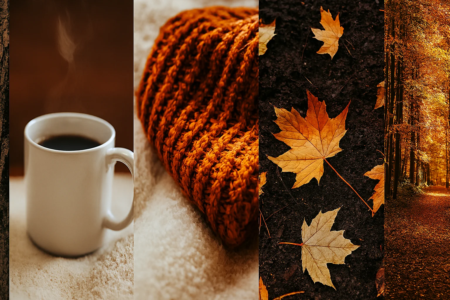
Before we dive into layers and filters, let’s set the mood. Close your eyes and think of autumn. What do you see? Is it the misty morning over a field of pumpkins? The intimate glow of a candle in a dark room? Hold onto that feeling—it will be your guide.
1. Choose Your Canvas & Palette:
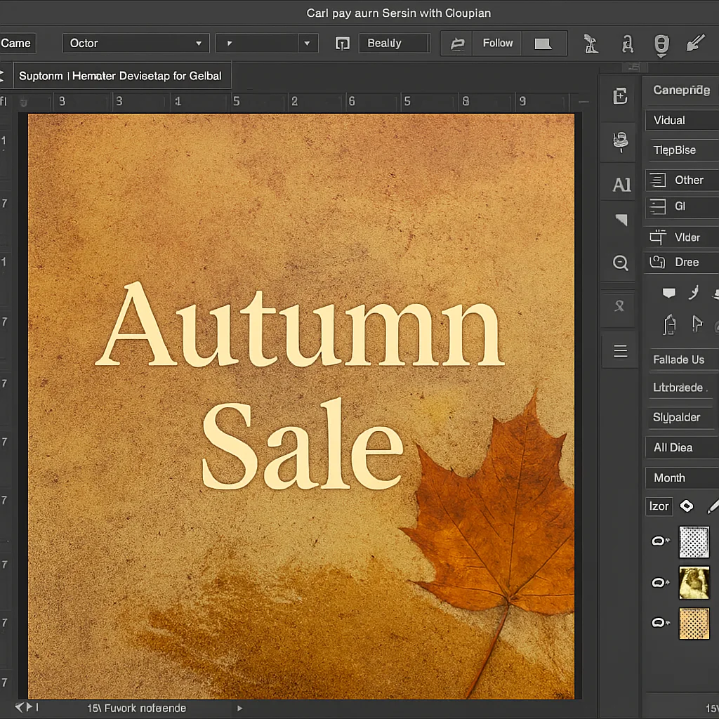
Start a new document in Photoshop. For a standard poster, A3 or A2 size at 300 DPI is perfect. Now, let’s talk colour. Ditch the garish oranges and think more nuanced.
-
The Foundation: Start with a deep, earthy background. Think charcoal grey, rich burgundy, or a dark olive green instead of plain white or black.
-
The Accents: Build your palette with burnt orange, mustard yellow, maroon, and cream. Use a tool like Adobe Color to extract these hues directly from a photograph of a autumn scene for authenticity.
This initial step, where vision meets the digital canvas, is where a project transforms from a idea into a design. It’s the foundational philosophy we apply to every project at www.sunygraphics.co.uk—where every colour choice is intentional.
Weaving the Textures of the Season
Autumn is a tactile season. It’s rough bark, crinkly leaves, soft wool, and smooth pumpkin skin. Incorporating these textures will add depth and a tangible, inviting quality to your poster.
2. Building Your Background:
-
Paper & Grunge: Import a high-resolution image of textured paper, a concrete wall, or a grunge brush set. Place it over your coloured background and experiment with blending modes like Overlay, Soft Light, or Multiply. Reduce the opacity until it feels integrated, not overpowering.
-
The Forest Floor: For a more natural look, use a photo of fallen leaves or wet soil as your base texture. Desaturate it and play with the contrast and blending modes to create a unique, organic foundation.
The Art of Composition: Telling an Autumnal Story
Your focal point is the heart of your poster. What is the main character of your autumn story?
3. Incorporating Your Focal Point:
This could be:
-
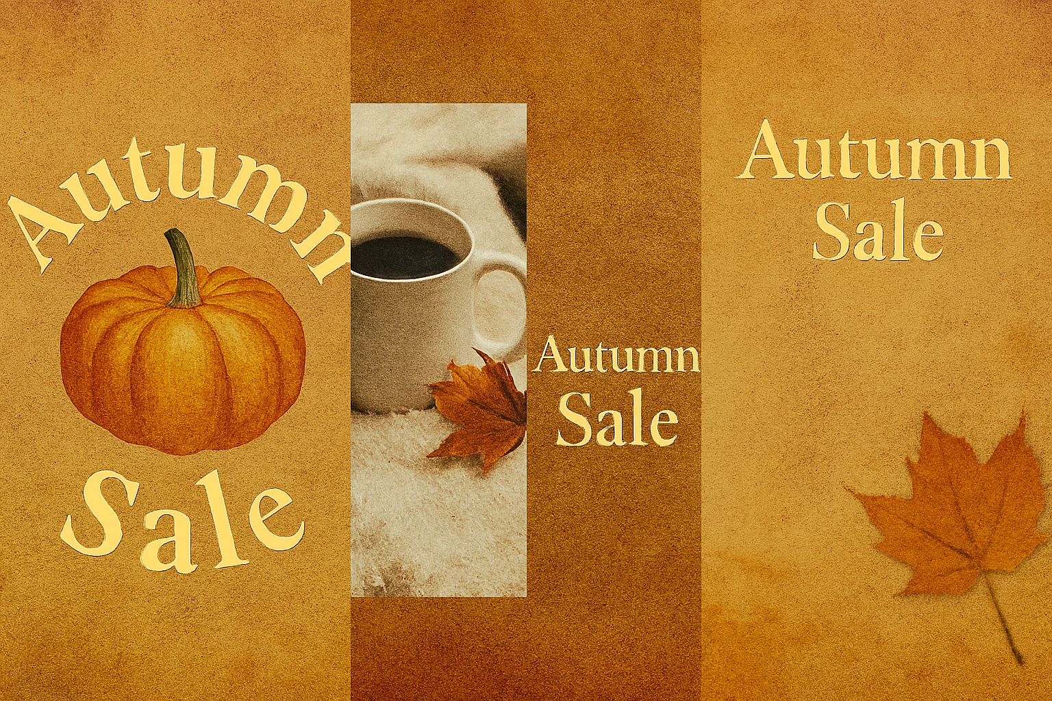
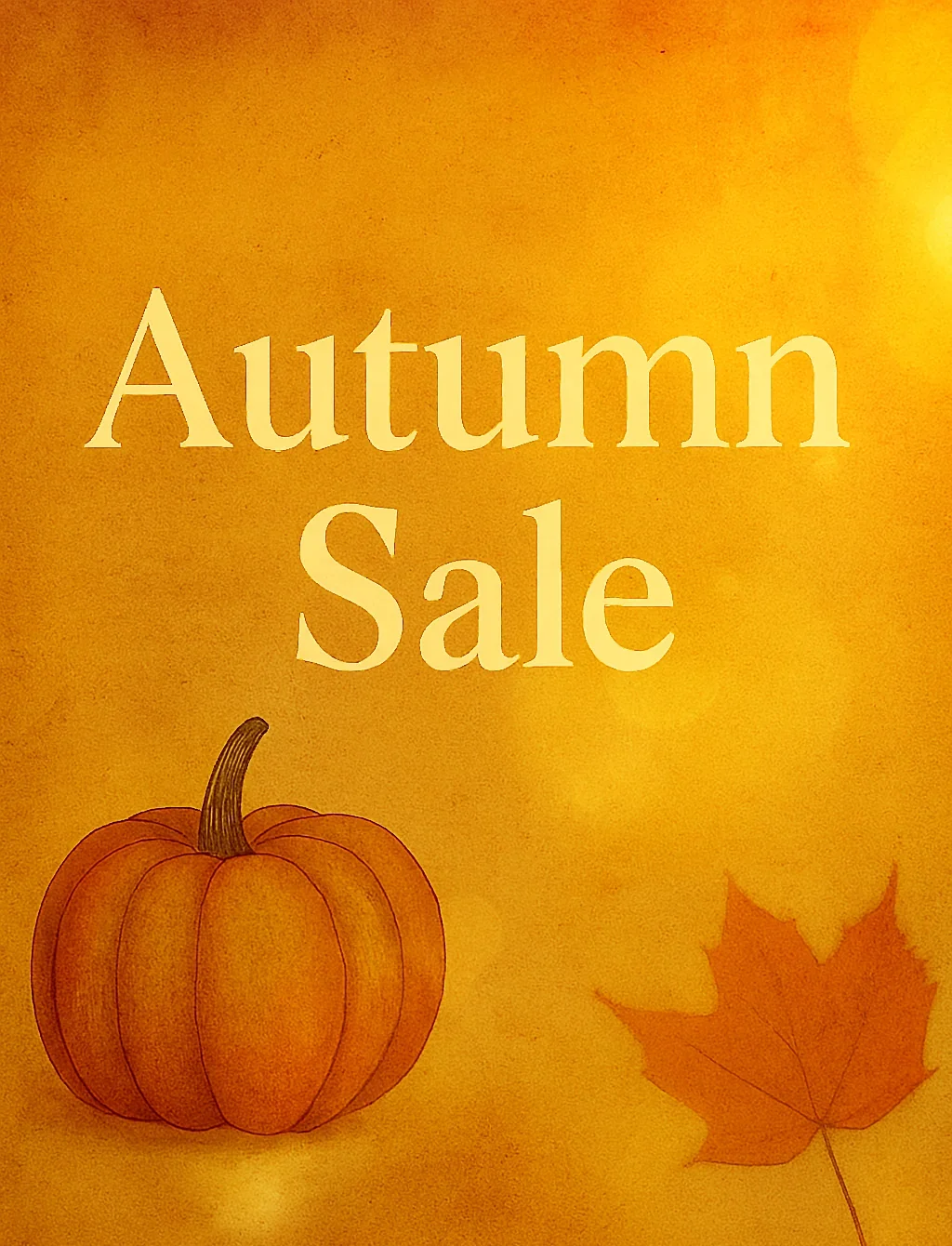
A beautifully illustrated pumpkin or maple leaf.
-
A photograph of a cozy setting.
-
The main text of your event itself, treated as art.
Use the Rule of Thirds to place your focal point off-center for a more dynamic composition. Create a visual hierarchy—guide the viewer’s eye from the most important element to the secondary details.
Typography That Whispers and Warms
The font you choose must sing in harmony with your visuals. Autumn calls for warmth and character.
4. Choosing & Styling Your Fonts:
-
Serif Fonts (like Garamond, Playfair Display) evoke a classic, timeless, and cozy feeling—perfect for a bookshop event or a harvest dinner.
-
Handwritten Scripts add a personal, artisanal touch, ideal for a craft fair or a small café.
-
Sturdy Sans-Serifs (like Montserrat or Proxima Nova) can provide a modern contrast to the organic elements, making certain text pop.
Pro Tip: Add a subtle Inner Shadow or a Texturize filter (Filter > Filter Gallery > Texturizer) to your text layers to make them feel like they are part of the textured background, not just sitting on top of it. This level of detail is what makes a design feel complete and professional, a standard we strive for in every piece created at www.sunygraphics.co.uk.
The Final Glow: Lighting and Effects
This is where we add the “soul-stirring” magic. Autumn light is low, golden, and dramatic.
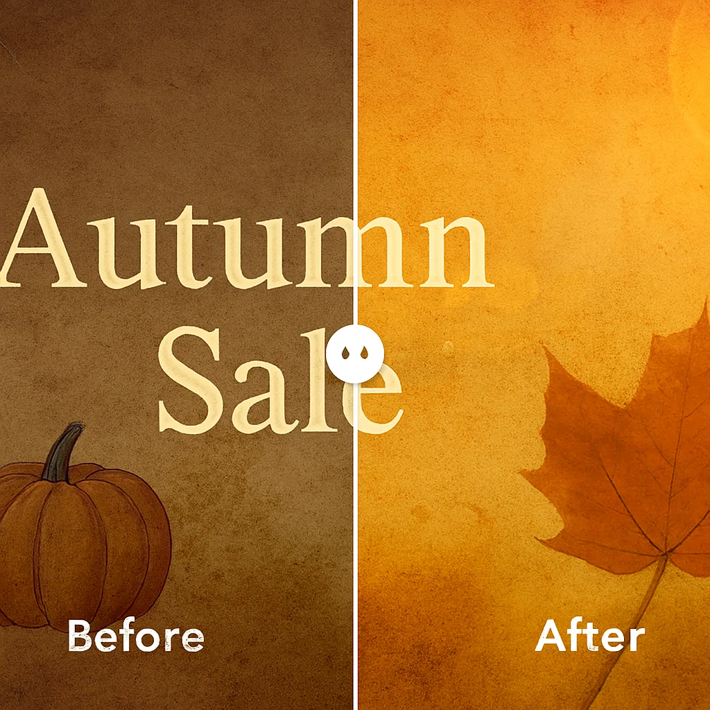
5. Colour Grading for a Golden Hour Feel:
-
Go to Layer > New Adjustment Layer > Photo Filter. Choose a Warming Filter (85) or an orange shade and adjust the density to a subtle 10-25%.
-
Use a Gradient Map adjustment layer with a deep blue and a warm orange. Set the blending mode to Soft Light at a low opacity for a cinematic colour wash.
6. Adding Specks of Light:
Create a new layer, fill it with black, and go to Filter > Render > Lens Flare. Choose the 50-300mm Zoom and position it as a light source. Change the layer’s blending mode to Screen and reduce opacity. This mimics the beautiful, hazy glow of autumn sun.
Export and Share the Warmth
Once you’re happy, save your master file as a PSD. Then, for printing or web use, export a high-quality JPEG or PNG via File > Export > Export As.
You’ve done more than just design a poster. You’ve captured a feeling. You’ve woven together colour, texture, and light to create an artifact of the season that invites people in and makes them feel something.
The true power of design lies in this emotional connection. It’s about building a bridge between an idea and an audience, a principle we live by at www.sunygraphics.co.uk. Now, go and create something beautiful. The world is waiting to feel the warmth of your autumn magic.