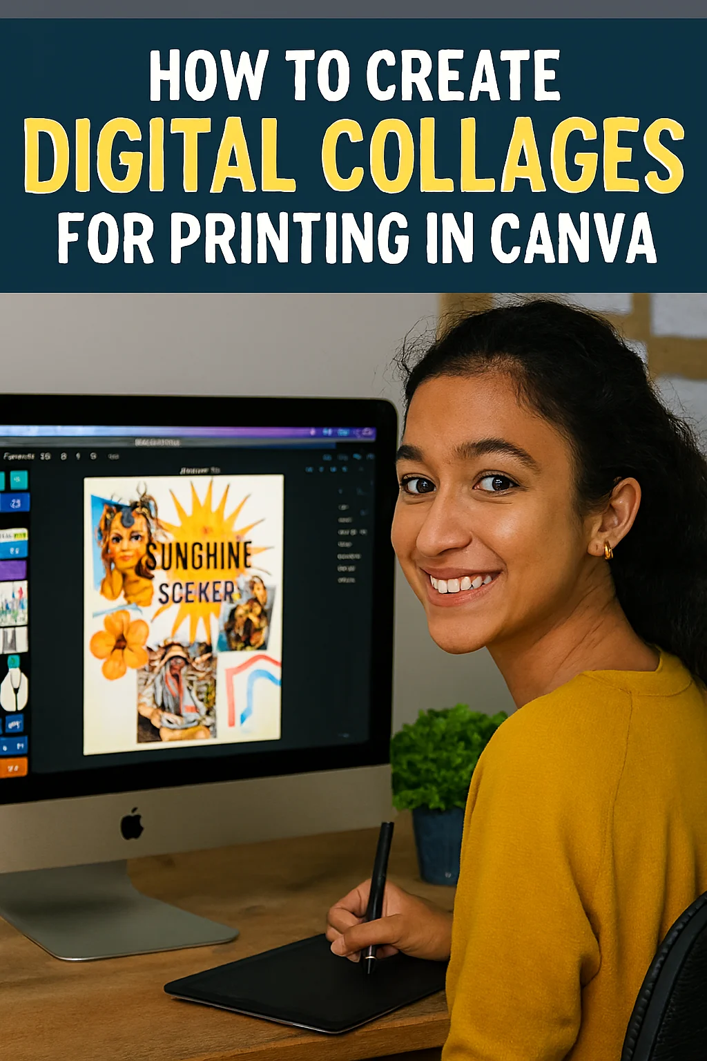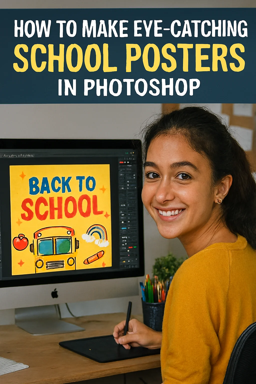
Stop the Scroll! How to Design School Posters in Photoshop That Everyone Actually Reads
Ever walked through your school hallway and felt… invisible? You spent hours on that poster for the bake sale, the football finals, or the science club meeting. You poured your heart into it, only to watch students walk right past it, eyes glued to their phones.
It’s a gut punch. Your message matters, and it deserves to be seen.
What if you could create a poster so vibrant, so compelling, that it makes people stop in their tracks? A piece of art that doesn’t just share information but builds excitement and gets the whole school talking.
You can. And you don’t need to be a professional graphic designer. You just need a little creativity and the power of Adobe Photoshop. Let’s transform your ideas from overlooked to unmissable.
Before You Even Open Photoshop: The Blueprint of a Great Poster
Great design starts not with a computer, but with a plan. Ask yourself these three questions:
-
Who is it for? (The Freshman Class? The Teachers? The entire school?)
-
What is the single most important message? (Date? Time? Event Name?)
-
What feeling do I want to evoke? (Energy? Mystery? Fun? Urgency?)
Your answers are your compass. They’ll guide every font, colour, and image choice you make.
The Photoshop Playbook: Your Step-by-Step Guide
Ready to create some magic? Fire up Photoshop and let’s begin.
Step 1: Set the Stage (The Perfect Canvas)
-
Go to File > New.
-
For a standard school poster, a good size is 18 x 24 inches.
-
Set the Resolution to 300 pixels/inch. This is crucial for a sharp, high-quality print. A blurry poster is the first step to being ignored.
-
Pro Tip: Name your file something clear, like
Science_Fair_Poster_Final.psd. Trust us, your future self will thank you.
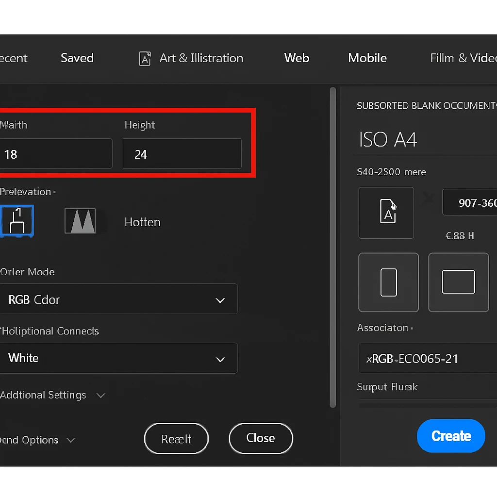
Caption: Setting up your canvas correctly from the start ensures your poster looks professional and print-ready.
Step 2: Craft Your Visual Foundation (Colour & Background)
The background sets the entire mood. Don’t just settle for plain white!
-
The Power of a Gradient: Use the Gradient Tool (G) to create a smooth blend of your school colours. A dark-to-light gradient adds instant depth and sophistication.
-
Textured & Grungy: Find a high-resolution image of a painted wall, crumpled paper, or a starry sky. Place it on your canvas and lower the Opacity to let it sit subtly behind your text. You can find incredible, free-to-use textures online.
-
Bold & Graphic: Sometimes, a bold, solid block of colour is all you need. Use the Paint Bucket Tool (G) to make a vibrant statement.
The team at www.sunygraphics.co.uk lives by this rule: your background shouldn’t just be empty space; it should be the first element to grab attention.
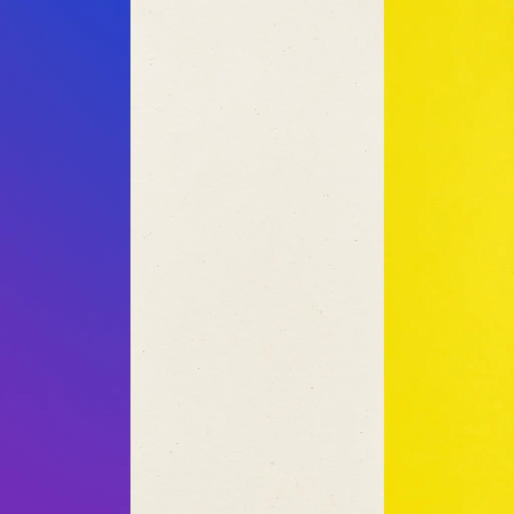
Caption: Different backgrounds create completely different feelings. Which one fits your event’s vibe?
Step 3: The Art of the Headline (Typography That Talks)
This is where your poster finds its voice.
-
Choose TWO Fonts Max: One for the headline, one for the body. Any more, and it looks messy. Pair a bold, attention-grabbing Display Font for the title with a clean, easy-to-read Sans-Serif Font (like Arial or Open Sans) for the details.
-
Hierarchy is King: Your event name should be the biggest. The date and time should be the next biggest. Everything else is supporting detail. Play with size, weight (Bold/Regular), and even colour to create this flow.
-
Get Creative with Text: Right-click your text layer and select Blending Options. A subtle Stroke (outline) or Drop Shadow can make your text pop right off the page.
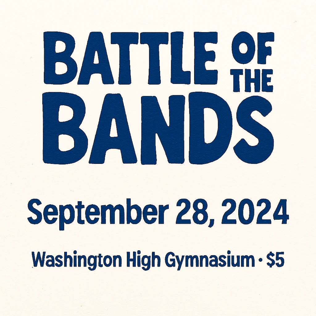
Caption: Clear typographic hierarchy guides the reader’s eye through the information in seconds.
Step 4: Incorporate Killer Imagery (A Picture is Worth 1,000 Words)
People connect with images faster than text.
-
High Quality Only: Never use a tiny, pixelated image. It ruins the entire poster.
-
Cut Out Subjects with Ease: Use the Quick Selection Tool (W) or the incredible Object Selection Tool to easily remove the background from a photo of a football player, a musician, or a science beaker. Placing a person or object on a clean background looks incredibly professional.
-
Use Icons: Can’t find the perfect photo? Websites offer free vector icons for everything. A simple, stylish icon of a basketball or a book can be more effective than a busy photo.
Remember, every image you use at www.sunygraphics.co.uk is carefully chosen to tell a story and connect with the audience on an emotional level.
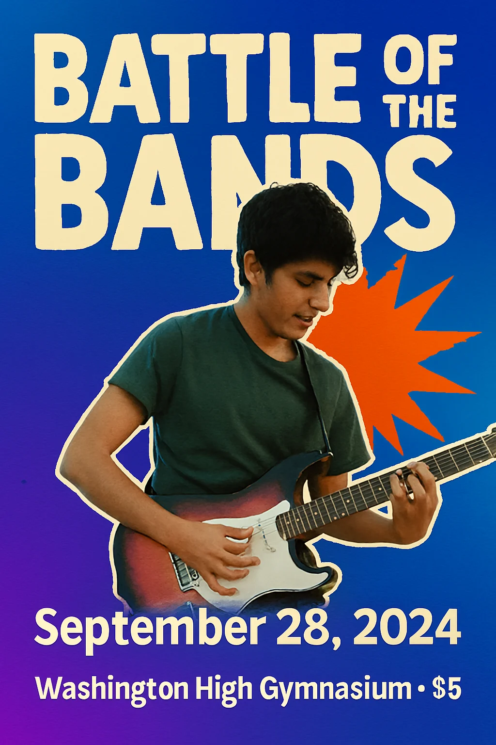
Caption: A clean cut-out image creates a dynamic, layered look that feels modern and engaging.
Step 5: The Final Polish (Layout & Spacing)
This is the secret sauce that separates amateurs from pros.
-
Embrace White Space: Don’t feel the need to fill every single millimetre. “White space” (or empty space) gives the viewer’s eye a place to rest and makes your design feel clean and intentional.
-
Align Everything! Use Photoshop’s Alignment Tools to ensure every text box and image is neatly lined up. A misaligned element is the quickest way to make a poster look “off.”
-
Add a Final “Punch”: Create a simple shape (a circle, a line) behind your most important information to make it stand out. Or add a subtle, light burst behind your headline using a soft brush.
You’ve Got This!
Look back at your creation. You started with a blank canvas and a idea. Now, you have a powerful piece of visual communication. You didn’t just make a poster; you created an experience. You built anticipation. You made your cause impossible to ignore.
The next time you have a message to share with your school, remember this: you have the power to make people stop, look, and listen. Now go and fill those hallways with colour, creativity, and the buzz of excited students.
Feeling inspired but short on time? Or maybe you have a big project that needs a professional touch? The creative experts at www.sunygraphics.co.uk are here to help bring your biggest and brightest ideas to life, with stunning designs that truly make an impact.