Beyond the Rainbow: A Designer’s Practical Guide to Colour Theory
Let’s be honest: colour is magic. It’s the first thing a viewer notices, the silent messenger that conveys mood, emotion, and meaning before a single word is read. Getting it right can elevate a design from good to unforgettable. Getting it wrong can render it confusing, unappealing, or even unreadable.
But you don’t need to be a magician to master colour. The “magic” is actually a science called colour theory—a set of guiding principles that, once understood, become your most powerful design tool. This guide will walk you through these principles not as abstract ideas, but as practical tools you can use in your next project.
The Foundation: Understanding the Colour Wheel
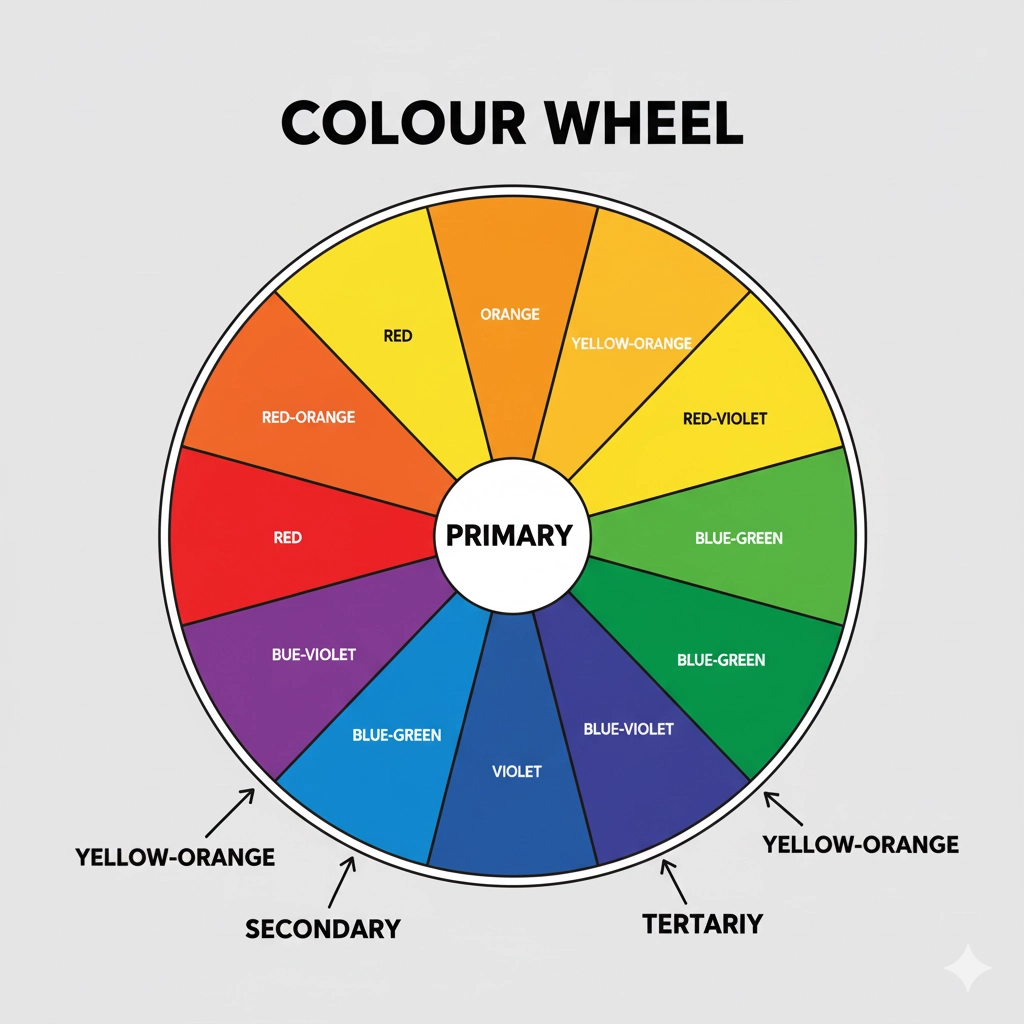
Before we build a house, we need to know about bricks. The colour wheel is our brick. It’s a visual representation of colour relationships, and every design decision starts here.
-
Primary Colours (Red, Yellow, Blue): The three pigment colours that cannot be formed by any combination of other colours. All other colours are derived from these three. Think of them as the parents of the colour family.
-
Secondary Colours (Green, Orange, Purple): These are created by mixing two primary colours equally.
-
Red + Yellow = Orange
-
Yellow + Blue = Green
-
Blue + Red = Purple (or Violet)
-
-
Tertiary Colours (Red-Orange, Yellow-Green, Blue-Violet, etc.): These are created by mixing a primary colour with a secondary colour next to it on the wheel. This is how we get the complex and nuanced colours like magenta, teal, and amber.
Speaking the Language: Hue, Saturation, and Value
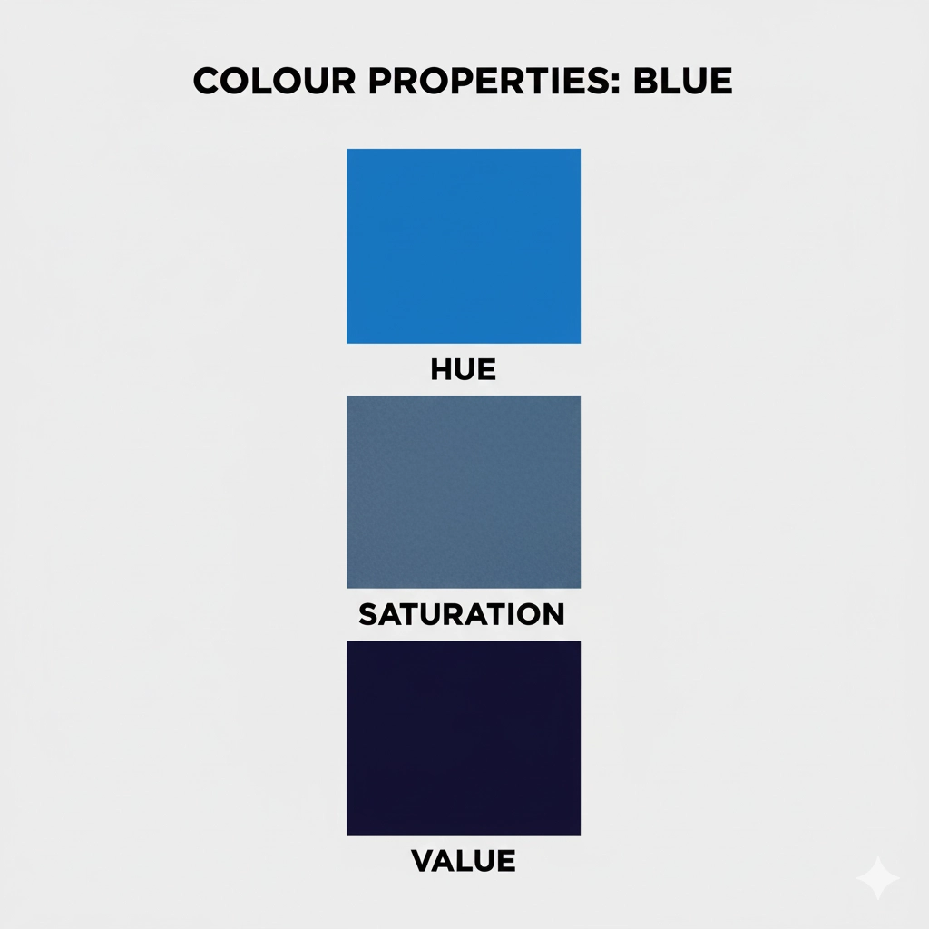
To move beyond basic colours, we need a more precise vocabulary. These three terms allow you to describe any colour with accuracy.
-
Hue: This is the pure colour itself—red, blue, yellow, etc. It’s essentially the name we give a colour straight from the colour wheel.
-
Saturation (or Chroma): This refers to the intensity or purity of a hue. A colour with high saturation is vivid and brilliant. A colour with low saturation is muted, greyed, and subtle. Think of it as turning up the “colour” slider on your TV.
-
Value (or Brightness): This describes how light or dark a colour is. Adding white to a hue creates a tint. Adding black to a hue creates a shade. Adding grey creates a tone. This is crucial for creating contrast and readability.
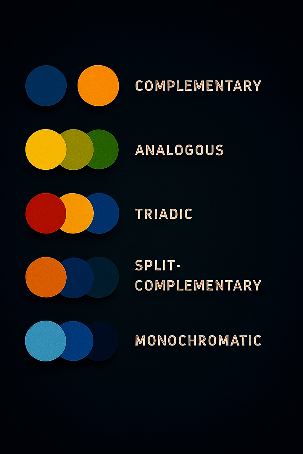
Creating Harmony: Classic Colour Schemes
Colour harmony is about arranging colours in a way that is pleasing to the eye. These classic schemes are your go-to recipes for creating balanced designs.
-
Complementary: Colours that are opposite each other on the colour wheel (e.g., Red & Green, Blue & Orange). This scheme creates maximum contrast and high impact. It’s great for making elements pop, but can be jarring if overused. Best for call-to-action buttons or important headlines.
-
Analogous: Colours that are next to each other on the wheel (e.g., Blue, Blue-Green, Green). This scheme is harmonious, serene, and comfortable to look at. It’s often found in nature and is perfect for creating peaceful, cohesive designs.
-
Triadic: Three colours that are evenly spaced around the wheel (e.g., Red, Yellow, Blue). This scheme offers strong visual contrast while retaining balance and colour richness. It’s vibrant without being as harsh as a complementary scheme.
-
Split-Complementary: A variation on complementary. You take one base colour and then use the two colours adjacent to its complement. This scheme gives you strong contrast but with less tension than a straight complementary scheme. It’s easier to balance and more beginner-friendly.
-
Monochromatic: This is the masterclass in simplicity and elegance. It uses only one hue, but plays with its tints, tones, and shades. This scheme is always harmonious, incredibly cohesive, and feels sophisticated and clean.
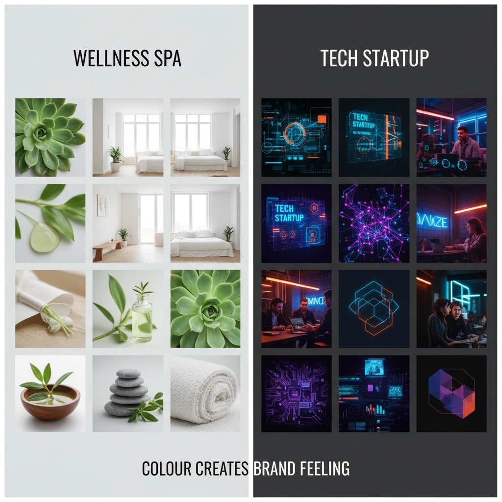
The Psychology of Colour: What Your Palette Communicates
Colours don’t just look different; they feel different. Cultural context can influence this, but some general psychological associations in Western culture are:
-
Red: Energy, passion, danger, excitement, love. (Great for food, sales, and urgent actions.)
-
Blue: Trust, security, calm, professionalism, stability. (Used by banks, tech companies, and healthcare.)
-
Yellow: Optimism, happiness, warmth, caution. (Captures attention but can be straining in large doses.)
-
Green: Growth, health, nature, money, tranquility. (Ideal for organic, environmental, or financial brands.)
-
Purple: Luxury, creativity, wisdom, mystery. (Often associated with royalty and beauty products.)
-
Orange: Playfulness, confidence, friendliness, energy. (A less aggressive alternative to red.)
-
Black: Sophistication, power, elegance, death. (Extremely versatile for luxury and modern design.)
-
White: Purity, simplicity, cleanliness, space. (The foundation of minimalist design.)
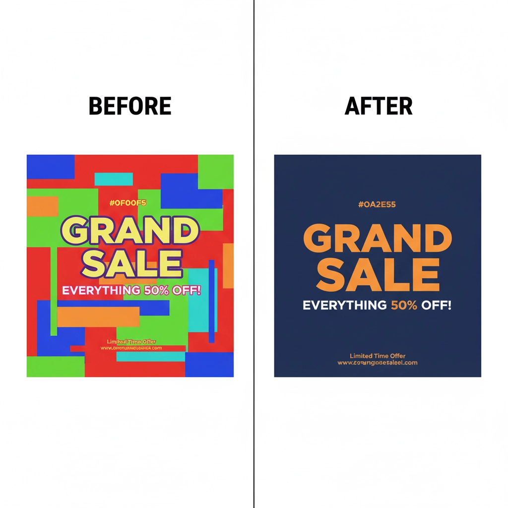
Putting It All Together: A Practical Checklist
-
Define the Goal & Emotion: Before you choose a single colour, ask: What is the goal of this design? What emotion should the viewer feel? Trust? excitement? calm? Let the psychology guide your initial hue choice.
-
Choose a Dominant Colour: This will be your main brand colour or the background. It sets the overall tone.
-
Select a Colour Scheme: Based on your goal, choose a harmonious scheme (complementary, analogous, etc.). Use the colour wheel as your guide.
-
Apply the 60-30-10 Rule: This is a classic interior design rule that works perfectly for graphic design.
-
60% of your design should be your dominant colour (e.g., background).
-
30% should be a secondary colour (e.g., supporting graphics, text blocks).
-
10% should be an accent colour (e.g., call-to-action buttons, highlights). This creates balance and visual hierarchy.
-
-
Prioritize Readability and Contrast: Never sacrifice usability for style. Ensure there is enough value contrast between text and its background. Dark text on a light background (or vice versa) is always the most legible.
Conclusion: Practice Makes Perfect
Colour theory is a framework, not a rigid set of rules. The real learning happens by doing. Start by analysing the colour palettes in designs you admire. Use tools like the colour picker in your design software to dissect them. Create your own palettes and experiment fearlessly.
Remember, colour is a conversation between your design and your audience. By learning its language, you can ensure your message is not just seen, but felt. Now go and paint the world with intention